KANNA
A brand revamp full of color and joy
Hemp wellness company.
Needs
.avif)
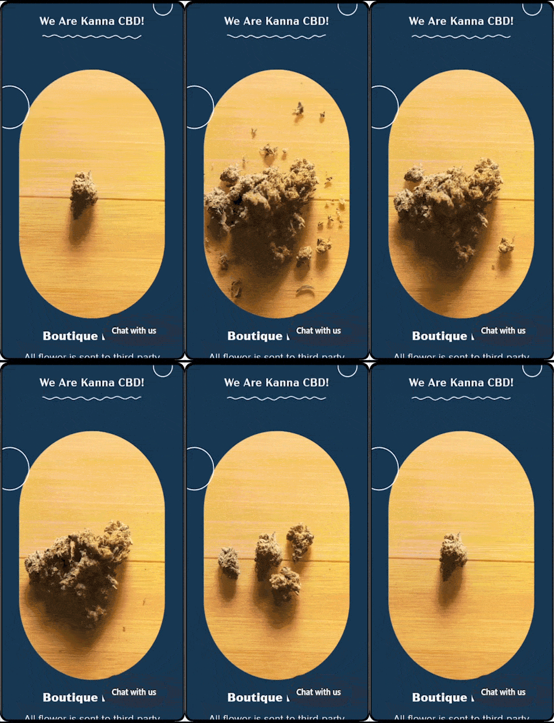
"We are so happy with our website redesign by LanternSol!!!! Beautiful craftsmanship and fantastic customer service, we truly appreciate their talents! We were able to add GIFS to our website and they made our products come to life by placing the GIFS in unique places throughout the website design. So awesome."
The Challenge
Kanna is a brand that specializes in cannabic products and experiences. They needed help redesigning the website for a remarkable IU/UX that highlighted the fun and professional experience customers could expect.
.avif)
.avif)
Design With Purpose
We identified their unique dope points through in-depth interviews with the Kanna crew. In order to align with these, we embraced a fun approach that made the Kanna brand and site feel more friendly and joyful. In addition, the new brand voice positions Kanna as a technology-powered brand that doesn't lose sight of its cannabis knowledge and high expertise.
From Scratch
We created a website from scratch that better aligned with Kanna's profile. We focused on bringing joy, dynamism, and a better user experience to bring in the feeling of being in a lounge.


Critical Elements
Some of the critical elements for this site are movement and color. Not only are the backgrounds leading your navigation and giving you different visual experiences, but in every corner, you can find animated elements that add a layer of dynamism to the page and connect the joyful experience of the brand with even the simplest details.

Building Trust, Through Clarity
Latest Work

SMRTFT
How Strategic Paid Media and Optimization Fueled Major Growth
PPC + Google Ads + Meta Ads
Tib Bar Guy
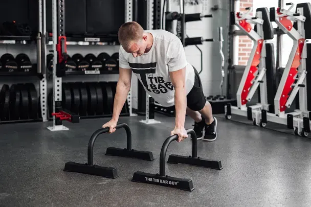
360° Brand Revamp, with $4.5M+ Revenue Generated
Logo Redesign + Web Dev + SEO + PPC + Email Marketing

InfiniWell
Strategic SEO That Increased Rankings, Traffic, and Revenue
SEO
JPK Landscaping
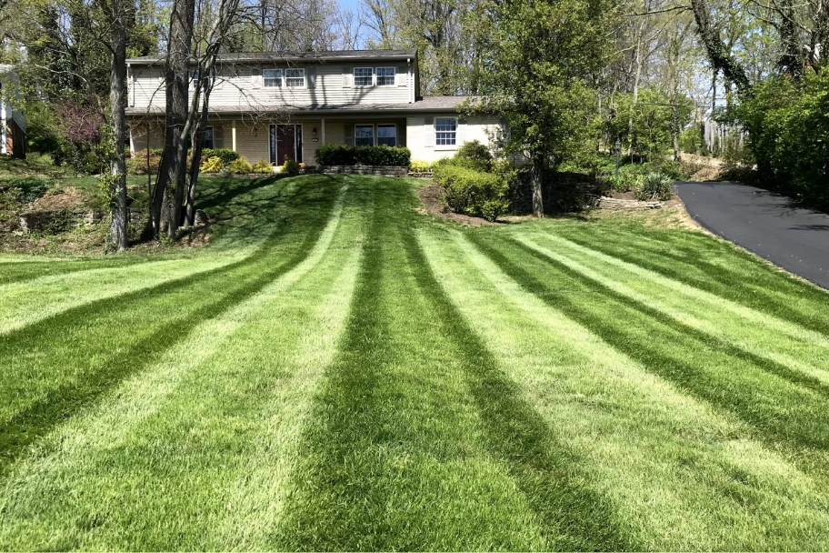
Turning Local Search into a Consistent Acquisition Channel
SEO

LACTECK
Scaling a Maternal Brand to a High Conversion Shopify Store
Logo Refresh + Website Development + Product Photography
Reilly Chance Collection
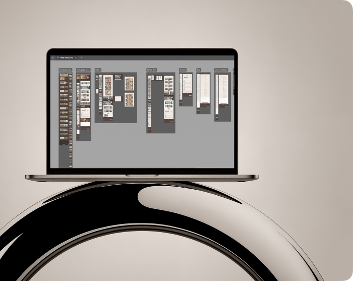
Heritage Craftsmanship, Powered for E-commerce
Website Development
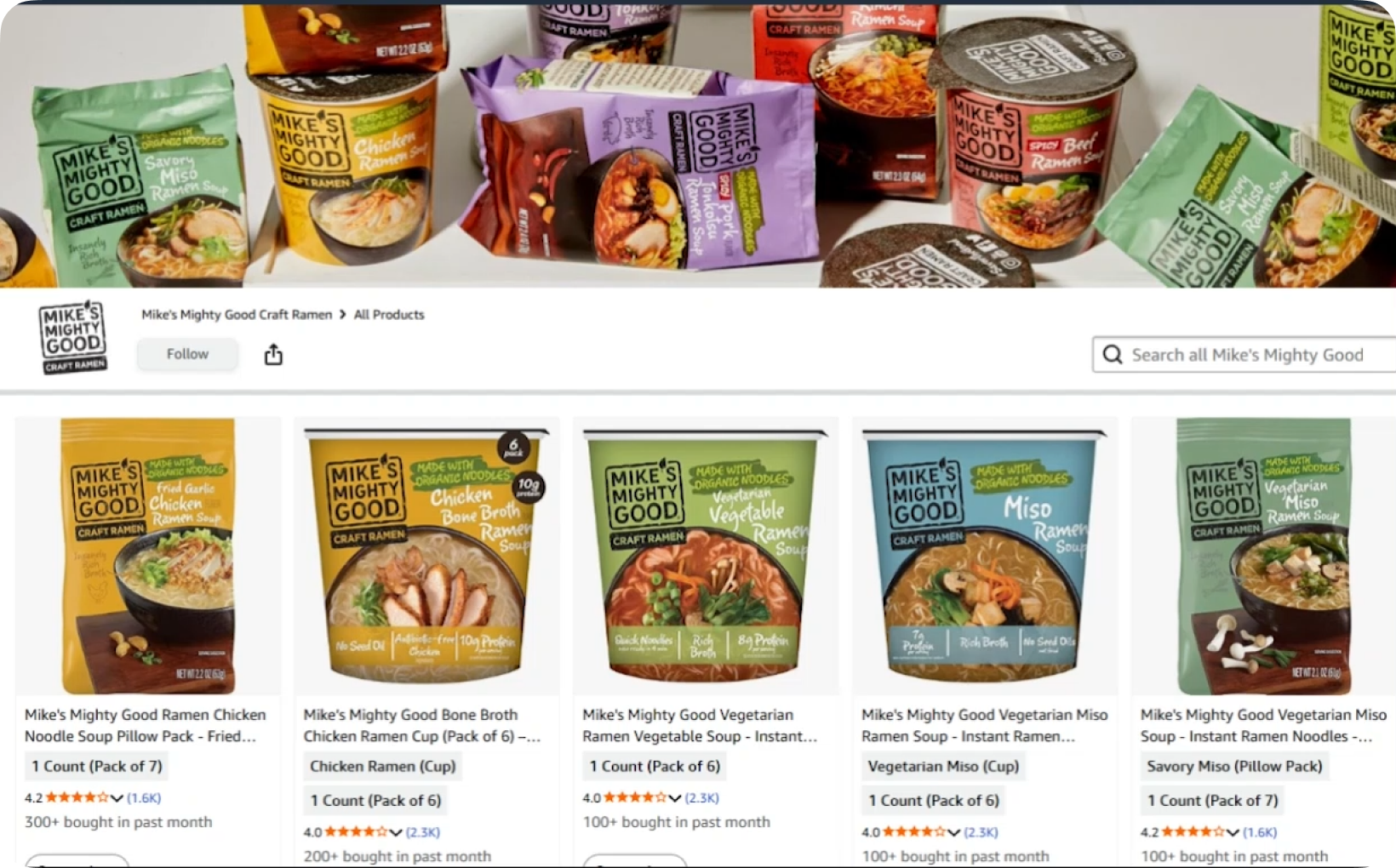
Mikes Mighty Goods
Restructure for compliance, clarity and conversion
Listing Optimization + SEO + Amazon Compliance
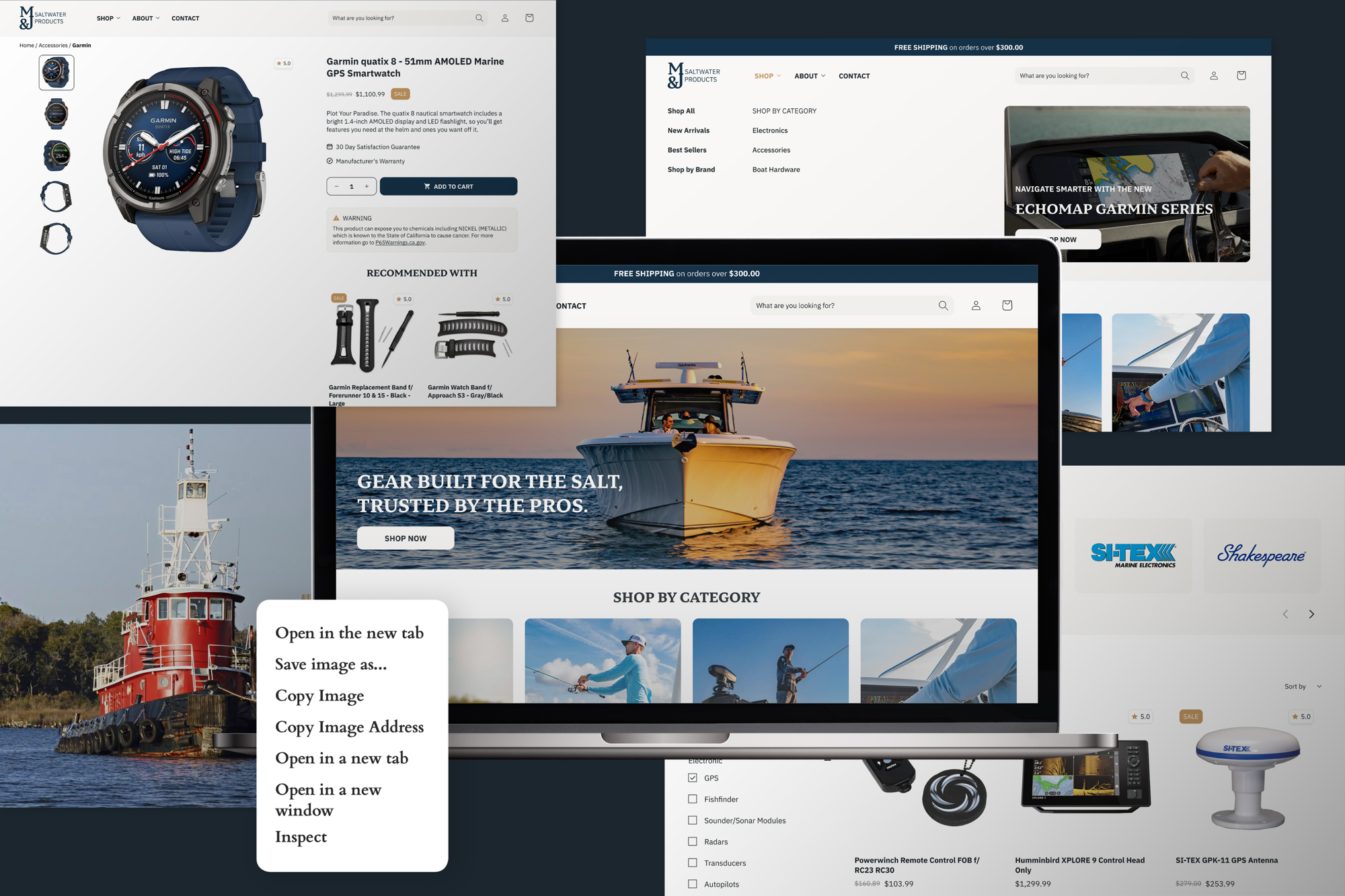
M&J Saltwater Products
A business kickstarter from the ground up with just a logo to start
Logo Redesign + Website Development
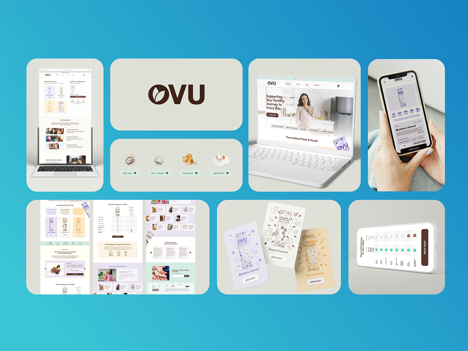
OVU
A business kickstart from the ground just with a logo
Logo Redesign + Website Development + SEO + PPC + Email Marketing
.webp)
Lifestyle of a Gen X
Luxury E-commerce Experience Built for Gen X Shoppers
Website Development
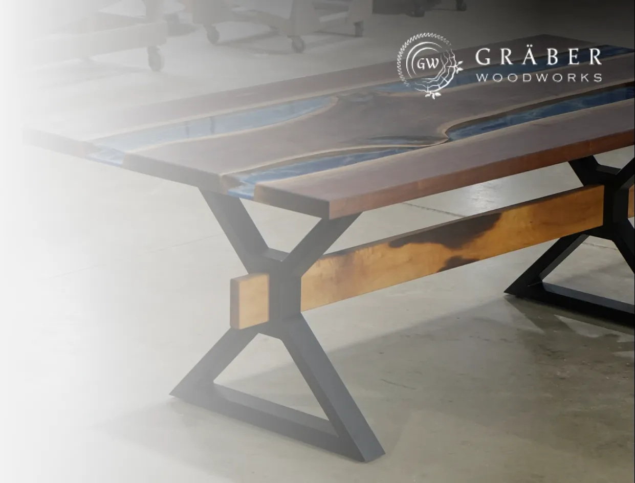
Graber Woodwork
How Graber Woodworks Scaled After Launching Its New Shopify Site
Website Redesign & Development
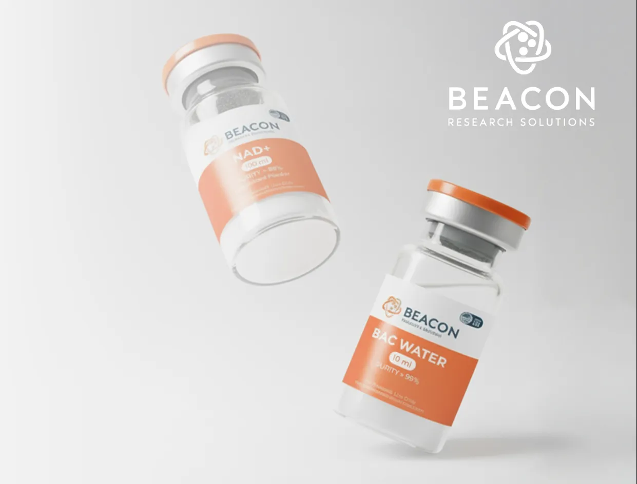
Beacon Research Solutions
UX + CRO Website Redesign Driving Organic Growth
Website Redesign & Development, AI Imagery
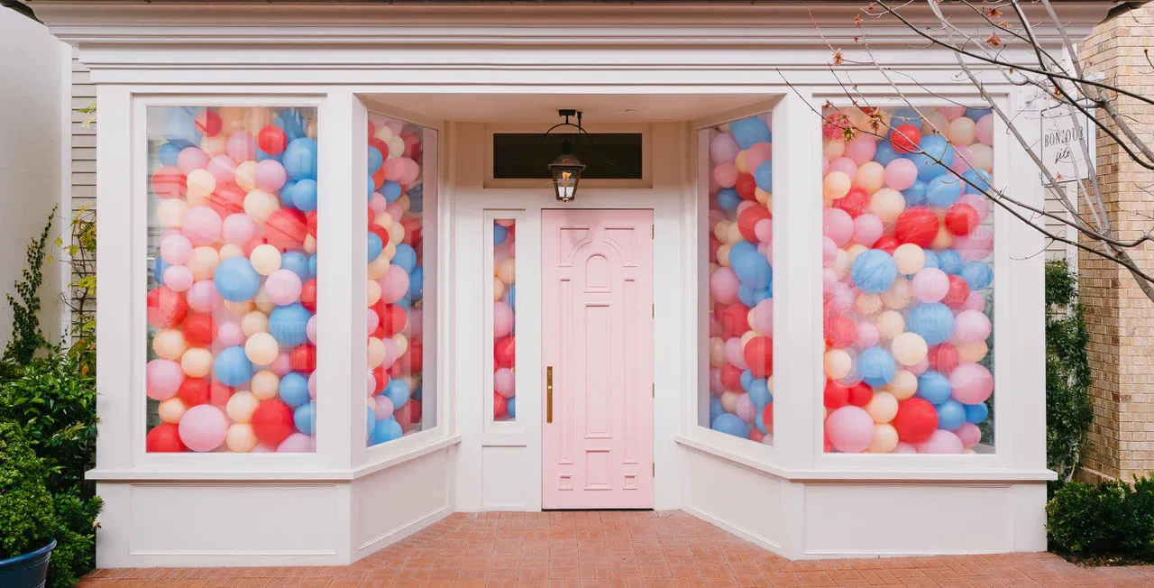
Bonjour Fête
Scaling a Premium Party Brand to 4.5x Monthly Revenue on Amazon
Amazon PPC Management, Listing Optimization, Conversion Rate Optimization (CRO)

Core Master
Scaling Google Ads to Profitable Growth Across the Board
PPC